Thursday, August 13, 2020

                                                                     TINY BUILD STUDiO


            Back when I first suggested to my Leading Man that we should build a more substantial building on the side of our house where our littles used to have their 'hut', he was clearly not as excited as I was since I could already envision all the possibilities. It's the story of our relationship really.


 He truly is my greatest supporter and a hero that makes so many of these crazy ideas of mine come to life. I suggested we keep the existing rock as the entry floor. See? I was saving him $$ already?


The foundation wall (18 x 5) that took a whole summer to decide.

We poured a foundation wall. It gave more height inside that way.
I had been gathering all kinds of building materials to re-purpose for this new addition - from Minnesota, Montana, Texas, California & lots of other interesting stops along the way.  I was seeing it as a great way to make room in the garage, and a way to save money.

I found a few new windows at a tag sale.

I convinced a friend of ours that built sets for theater productions as a hobby, that this wouldn't be that much different. I then promised to pay him in dinners and cash. Thankfully he agreed.
Framing finally begins!

This was one of those days when my vision sort of came to life!


We made it as large as we possibly could.I kept telling myself the size limitations seem to add to the charm.
Placing the windows so I can leave all kinds of wall space for the 'floating' bed frame.
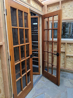
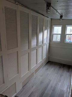
I was gifted doors for the entry as well as some shutters we used to cover the back wall. No need for drywall. Spraying it all one color made it feel larger and more welcoming.

What is prettier than these shutter doors on the wall?
FREE shutter doors on this wall!
                                               

We had to abandon our original plan to have a double bed frame that would be movable. Instead we ended up with a fixed option. It was a great mental exercise. And since I didn't want to invest too much money, the upper bunk option is really a perfect solution.


Leading Man doing finishing touches.

Love this view. 


This hinged part helps open this area when you a
walking towards the back.


The furniture on the bottom keeps changing. This option of a love seat and television worked great when a 
teen boy took over the space. 
PSA: TV and love seat have left the building

My favorite way to use it? My morning quiet time with the Lord
 in a cozy chair with a cup of coffee.

Lately, it has been a work-from-home office for our Daughter-in-Love.

I encourage you to find a space and call it your own. Get creative and work with what you have available. The, 
share it with others as often as you can.

Photo credit goes to Christina Vogt.

Friday, May 4, 2018

Project Spotlight: Cabinet Makeover

Project Spotlight: Cabinet Makeover

Hallway shelves can so easily become a catch-all where all design rules are thrown out and more is more.  The problem with that is that your eye has nowhere to rest visually- when you look that way your eye wants to look away instead of rest on the view of the shelves.

So, I will admit I saw this idea on Pinterest and randomly pinned it for a someday project.  Does anybody else have a folder of pins for "someday" inspiration that brings them such joy and inspiration when you just sit and review it all the way down to the original pin?  I am old school and used to collect all kinds of magazines and torn idea pages. The love of my life is delighted that Pinterest came along and the piles of magazines I just had to keep are gone. Anyhow...

Back to my client's hallway wall. There was a lot going on in this client's upstairs hallway and she needed more covered storage. Landing on this solution didn't require much convincing- we had a foundation with built-in shelves and just needed to upgrade them. It was going to visually brighten up the space as well as tuck everything away from view.


We did the math that would make all the small 'drawers' so we would have beautiful symmetry in our design.  I asked my builder/handy guy to create solid cabinet doors, to fit the space, with some slightly rounded edges and hidden hinges, I believe he used MDF.

Next was all the small 'drawer' fronts; the payoff on this is worth it, I promise. A thinner MDF can work here, no splinters just lots of sanding. This set of cabinets was larger than most, I was very thankful someone else was doing my sanding, painting and details. If you're doing this as a DIY, stay consistent in your finishes and lay everything out first before starting to attach.


Attach the 'drawer' fronts so nothing shows to carry off the illusion; from the back, you can drill, staple or glue (or all of the above) but plan to fill your holes before you paint (it's much easier to paint once the small 'drawers' are attached). Since the cardholder hardware is also your pull handle to open the cabinet door, you will want to make sure they are attached very well. We knew we were going to paint these as the existing shelves were already white and would only need to be trimmed out to look perfect.

I ordered all these adorable little pulls that came with adorable little screws that my handy guy was super excited about. However, to his credit, he made himself a template for the hardware holes and completed the task impressively fast!


The homeowner is a mid-west transplant so it was a clever and thoughtful touch to use an old atlas to make the inserts.  These pages were mounted on thin cardboard so they stayed put and then placed where they gave the homeowner the most visual joy when they walked by or opened them up.

The bottom space became the last place to finish off and luckily the homeowner was able to find the perfect size storage bin/basket for the existing height. She is now able to store sheets and towels in those and no one is the wiser!

Our finished project now keeps all the madness contained and out of sight, leaving you to enjoy the space rather than being that tried and true catch-all. Hope you enjoyed these photos and the process dialog. Please leave a comment if you have a question!

Monday, April 9, 2018


Spring brings beautiful new growth, changes in scenery and a chance for new beginnings.
I overlooked Spring for many years as I seem to be looking toward Summer and all the happy it brings me.

This spring is a little different for many reasons, I have been anxiously sitting on this new design, look, and idea for awhile;  waiting for it to be just right before the public unveiling of McFadden & Grace.

Design has been part of my daily life for as long as I can remember. It may have been when I built my Barbie amazing rooms instead of actually playing with the doll, mentally remodeling every room in my family home to fall asleep at night.  Or it may have started with all the multiple times I moved in my 20's and had to recreate a welcoming home.

Either way, since finishing design school back in the day, I have been blessed with so many opportunities to transform spaces for some amazing clients.  I hope to be able to highlight a few of these projects here in this space.

I look forward to sharing creative solutions for impossible spaces, unique table top decor, transforming vintage into modern useful pieces, and taking you along on an adventure of creative and innovative design .


                                                                     TINY BUILD STUDiO                                                   ...